
Designing Urgency: How I Redesigned Cradlewise's Dynamic Pricing Model
Overview
Cradlewise, an all-in-one sleep solution, provides a Convertible Smart Bassinet & Crib with AI-powered soothing, video and breath monitoring, and a sound machine, designed to grow with your baby up to 24 months.
Because the crib ships in limited monthly batches, Cradlewise uses a unique pricing model: the same crib costs different amounts depending on which shipping month you choose. Order sooner, pay more ; choose a later month, unlock bigger discounts. This helps the business manage inventory while nudging customers to plan ahead.
It's a very different mental model from standard e-commerce pricing — price, urgency, and delivery timing all live in one decision, on one small screen. This case study walks through how that pricing module evolved from 2023 to 2026.
My Role
Product Design & Strategy
Team
Hardik Somaiya (Product Manager), Chandni Venkataraman (Design Mentor)
Old Design Flow

What prompted a rethink of the flow?
In user interviews, this surfaced again and again: customers said they found the pricing model confusing and hard to make sense of at first glance. They weren't used to a product costing different amounts depending on shipping timing, and the existing carousel-based UI — where only 2-3 months were visible at a time — made it worse. Users had to swipe back and forth just to figure out:

Because the pricing logic itself was unfamiliar, the interface needed to work harder than a standard price-comparison UI — it had to teach the model while letting people compare prices in the same glance.
This is what shaped the core design problem: it wasn't just "make the carousel scrollable" — it was "help users understand and trust a pricing model they've never encountered before, fast enough that it doesn't create doubt at the point of purchase."
UX challenges
01
Explain core benefits
To keep users engaged and scrolling, we need to clearly communicate the core benefits of our product and explain how it can help them achieve more hours of sleep.
Lead forms are the sole method for capturing as many leads as possible. To achieve this, we must ensure the form collects the necessary information and is positioned correctly.
02
Emphasize the lead form
02
Emphasize the lead form
Lead forms are the sole method for capturing as many leads as possible. To achieve this, we must ensure the form collects the necessary information and is positioned correctly.
03
Real-world alignment
The copy and content on the page must align with real-world experiences to make our product appear more credible and problem-solving.
04
Recognition rather than recall
Content should be presented to minimize mental effort, allowing users to learn quickly, and have a more satisfying experience.
Time to iterate
Iteration 01
What was the rationale behind this design?
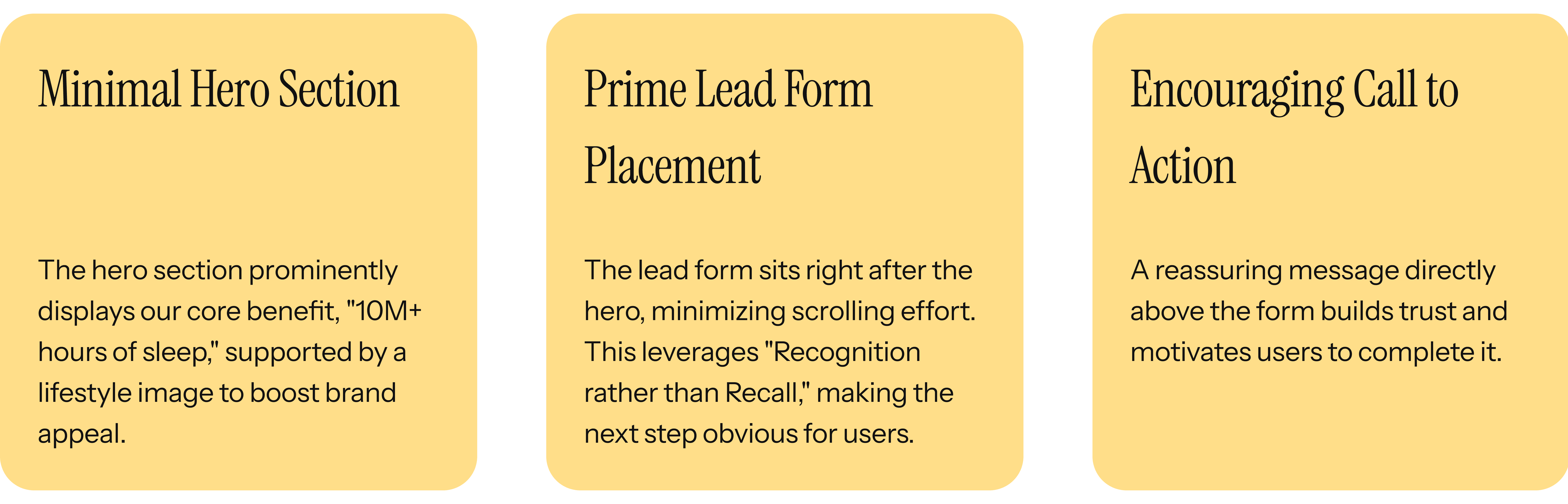
Why it didn't work?
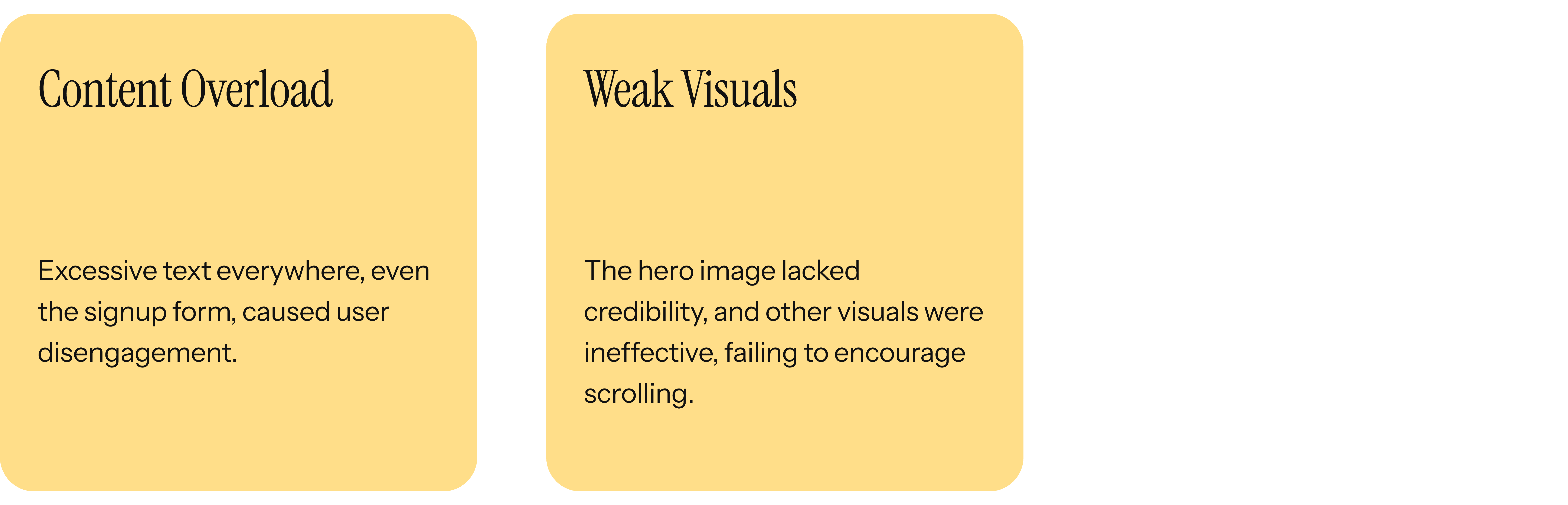
─────────────────────────────────────────────────────
────────────────────────────────────────
Iteration 02
What was the rationale behind this design?

Why it didn't work?

─────────────────────────────────────────────────────
────────────────────────────────────────
After a few design rounds, I finally landed on a design that's ready for its big test!
Designing Urgency: How I Redesigned Cradlewise's Dynamic Pricing Model
Overview
Cradlewise, an all-in-one sleep solution, provides a Convertible Smart Bassinet & Crib with AI-powered soothing, video and breath monitoring, and a sound machine, designed to grow with your baby up to 24 months.
Because the crib ships in limited monthly batches, Cradlewise uses a unique pricing model: the same crib costs different amounts depending on which shipping month you choose. Order sooner, pay more ; choose a later month, unlock bigger discounts. This helps the business manage inventory while nudging customers to plan ahead.
It's a very different mental model from standard e-commerce pricing — price, urgency, and delivery timing all live in one decision, on one small screen. This case study walks through how that pricing module evolved from 2023 to 2026.
My Role
Product Design & Strategy
Team
Hardik Somaiya (Product Manager), Chandni Venkataraman (Design Mentor)
Old Design Flow
What prompted a rethink of the flow?
In user interviews, this surfaced again and again: customers said they found the pricing model confusing and hard to make sense of at first glance. They weren't used to a product costing different amounts depending on shipping timing, and the existing carousel-based UI — where only 2-3 months were visible at a time — made it worse. Users had to swipe back and forth just to figure out:
Because the pricing logic itself was unfamiliar, the interface needed to work harder than a standard price-comparison UI — it had to teach the model while letting people compare prices in the same glance.
This is what shaped the core design problem: it wasn't just "make the carousel scrollable" — it was "help users understand and trust a pricing model they've never encountered before, fast enough that it doesn't create doubt at the point of purchase."
UX challenges
01
Explain core benefits
To keep users engaged and scrolling, we need to clearly communicate the core benefits of our product and explain how it can help them achieve more hours of sleep.
Lead forms are the sole method for capturing as many leads as possible. To achieve this, we must ensure the form collects the necessary information and is positioned correctly.
02
Emphasize the lead form
02
Emphasize the lead form
Lead forms are the sole method for capturing as many leads as possible. To achieve this, we must ensure the form collects the necessary information and is positioned correctly.
03
Real-world alignment
The copy and content on the page must align with real-world experiences to make our product appear more credible and problem-solving.
04
Recognition rather than recall
Content should be presented to minimize mental effort, allowing users to learn quickly, and have a more satisfying experience.
Time to iterate
Iteration 01
What was the rationale behind this design?
Why it didn't work?
─────────────────────────────────────────────────────
────────────────────────────────────────
Iteration 02
What was the rationale behind this design?
Why it didn't work?
─────────────────────────────────────────────────────
────────────────────────────────────────
After a few design rounds, I finally landed on a design that's ready for its big test!
Designing Urgency: How I Redesigned Cradlewise's Dynamic Pricing Model
Overview
Cradlewise, an all-in-one sleep solution, provides a Convertible Smart Bassinet & Crib with AI-powered soothing, video and breath monitoring, and a sound machine, designed to grow with your baby up to 24 months.
Because the crib ships in limited monthly batches, Cradlewise uses a unique pricing model: the same crib costs different amounts depending on which shipping month you choose. Order sooner, pay more ; choose a later month, unlock bigger discounts. This helps the business manage inventory while nudging customers to plan ahead.
It's a very different mental model from standard e-commerce pricing — price, urgency, and delivery timing all live in one decision, on one small screen. This case study walks through how that pricing module evolved from 2023 to 2026.
My Role
Product Design & Strategy
Team
Hardik Somaiya (Product Manager), Chandni Venkataraman (Design Mentor)
Old Design Flow
What prompted a rethink of the flow?
In user interviews, this surfaced again and again: customers said they found the pricing model confusing and hard to make sense of at first glance. They weren't used to a product costing different amounts depending on shipping timing, and the existing carousel-based UI — where only 2-3 months were visible at a time — made it worse. Users had to swipe back and forth just to figure out:
Because the pricing logic itself was unfamiliar, the interface needed to work harder than a standard price-comparison UI — it had to teach the model while letting people compare prices in the same glance.
This is what shaped the core design problem: it wasn't just "make the carousel scrollable" — it was "help users understand and trust a pricing model they've never encountered before, fast enough that it doesn't create doubt at the point of purchase."
UX challenges
01
Explain core benefits
To keep users engaged and scrolling, we need to clearly communicate the core benefits of our product and explain how it can help them achieve more hours of sleep.
Lead forms are the sole method for capturing as many leads as possible. To achieve this, we must ensure the form collects the necessary information and is positioned correctly.
02
Emphasize the lead form
02
Emphasize the lead form
Lead forms are the sole method for capturing as many leads as possible. To achieve this, we must ensure the form collects the necessary information and is positioned correctly.
03
Real-world alignment
The copy and content on the page must align with real-world experiences to make our product appear more credible and problem-solving.
04
Recognition rather than recall
Content should be presented to minimize mental effort, allowing users to learn quickly, and have a more satisfying experience.
Time to iterate
Iteration 01
What was the rationale behind this design?
Why it didn't work?
─────────────────────────────────────────────────────
────────────────────────────────────────
Iteration 02
What was the rationale behind this design?
Why it didn't work?
─────────────────────────────────────────────────────
────────────────────────────────────────
After a few design rounds, I finally landed on a design that's ready for its big test!
A short video to understand what our product really does!
What are users' initial expectations when they land on our marketing page?
Learning about the product
Users want to understand the crib's features (e.g., monitor, soothing, conversion) and benefits (more sleep, safety).
Checking price and deals
Users are interested in the cost, potential savings, and financing options.
Seeking trust and credibility
Users look for reviews, testimonials, and certifications to validate the product.
Finding solutions for sleep issues
Parents are looking for a way to improve their baby's sleep and, by extension, their own.
UX challenges
01
Explain core benefits
To keep users engaged and scrolling, we need to clearly communicate the core benefits of our product and explain how it can help them achieve more hours of sleep.
02
Emphasize the lead form
Lead forms are the sole method for capturing as many leads as possible. To achieve this, we must ensure the form collects the necessary information and is positioned correctly.
03
Real-world alignment
The copy and content on the page must align with real-world experiences to make our product appear more credible and problem-solving.
04
Recognition rather than recall
Content should be presented to minimize mental effort, allowing users to learn quickly, and have a more satisfying experience.
Time to iterate
Iteration 01
What was the rationale behind this design?
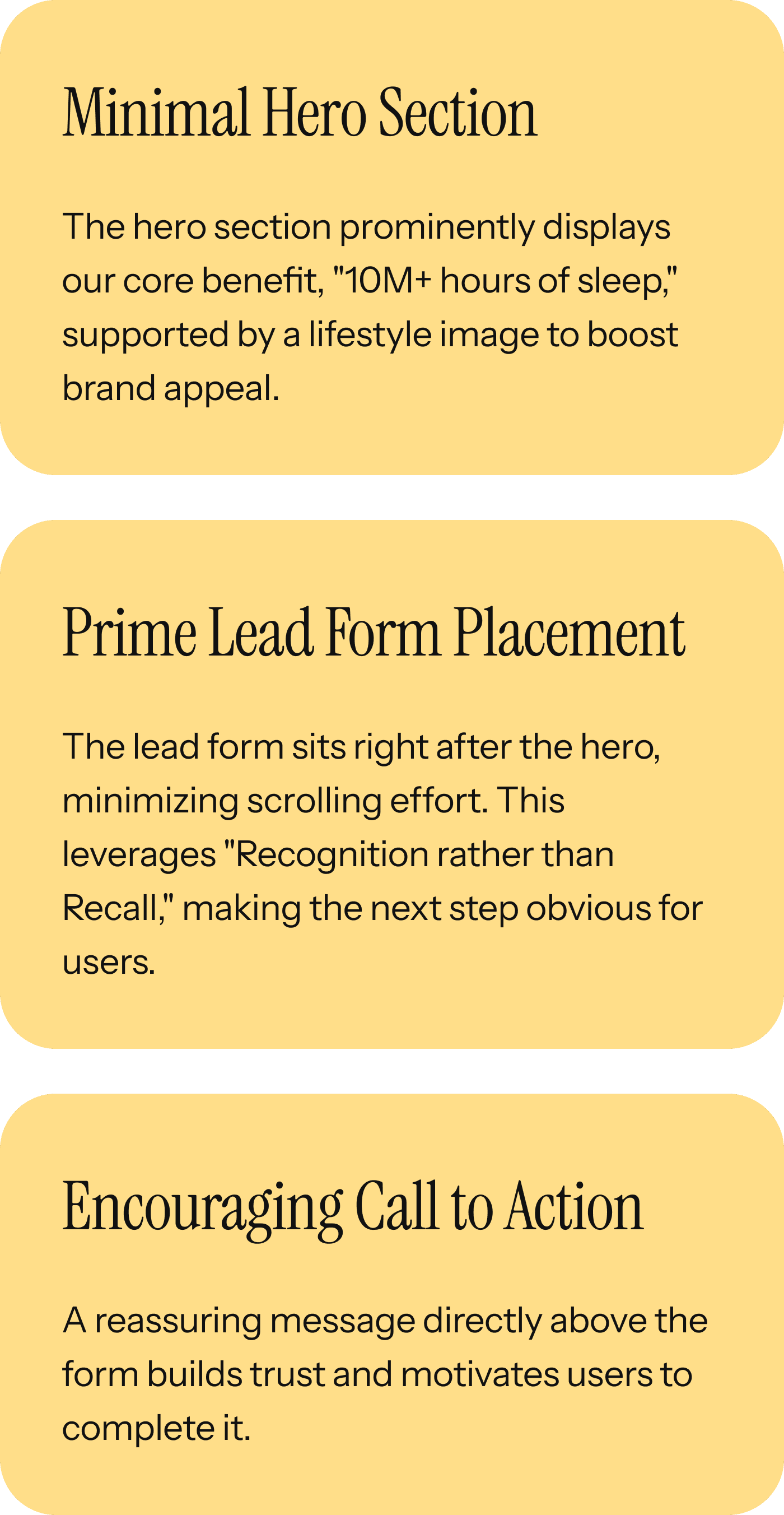
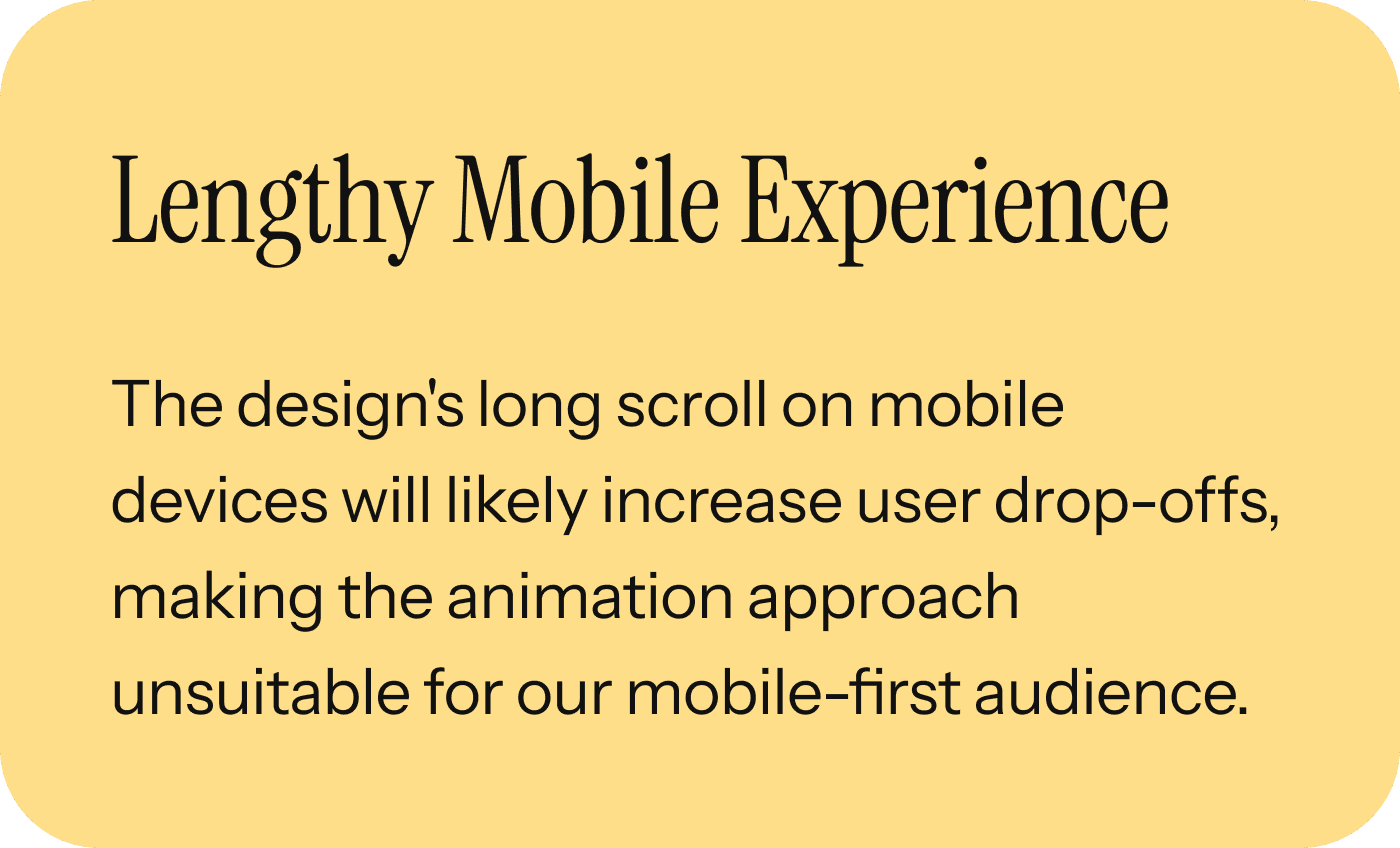
Why it didn't work?
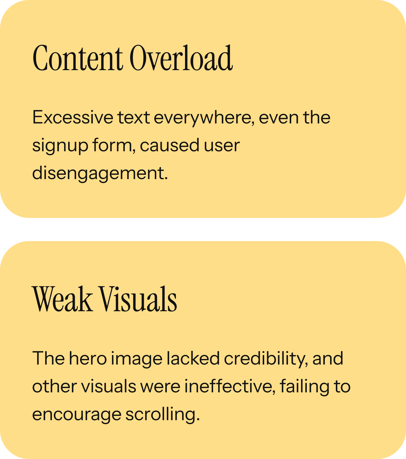
─────────────────────
After a few design rounds,
I finally landed on a design that's
ready for its big test!
Why it didn't work?
─────────────────────